
Design is one of the important elements of a website. It may sound obvious, but many companies underestimate the importance that a high-quality website design will have on people’s impression of your business.
By nature, humans are constantly, and sometimes unintentionally, judging everything as good, bad or neutral. When most visitors land on a website, they’ll notice the design first and will make a judgement on your business based on the design’s quality.
When that initial judgement is positive, there’s a higher chance that the visitor will engage further with your website and become one step closer to reaching out.
Furthermore, the design of your website needs to be more than just “pretty”. It must be relevant to the types of people you want to attract and dynamic enough to encourage visitors to continue scrolling.
In this article, we’ll explore 6 dos and don’ts of web design.
Don’t: Add Too Many Design Elements
It’s tempting to go overboard on your website with images, fonts, icons and colors. But it’s imperative to practice restraint and view your website with an editing eye. Having inconsistent or too many design elements can overwhelm and confuse your visitors and hinder your brand development.
Do: Establish a Consistent Brand Style
Instead, establish a consistent design style that aligns with your company’s emotional values and voice to make an immediate lasting impression on your visitors.
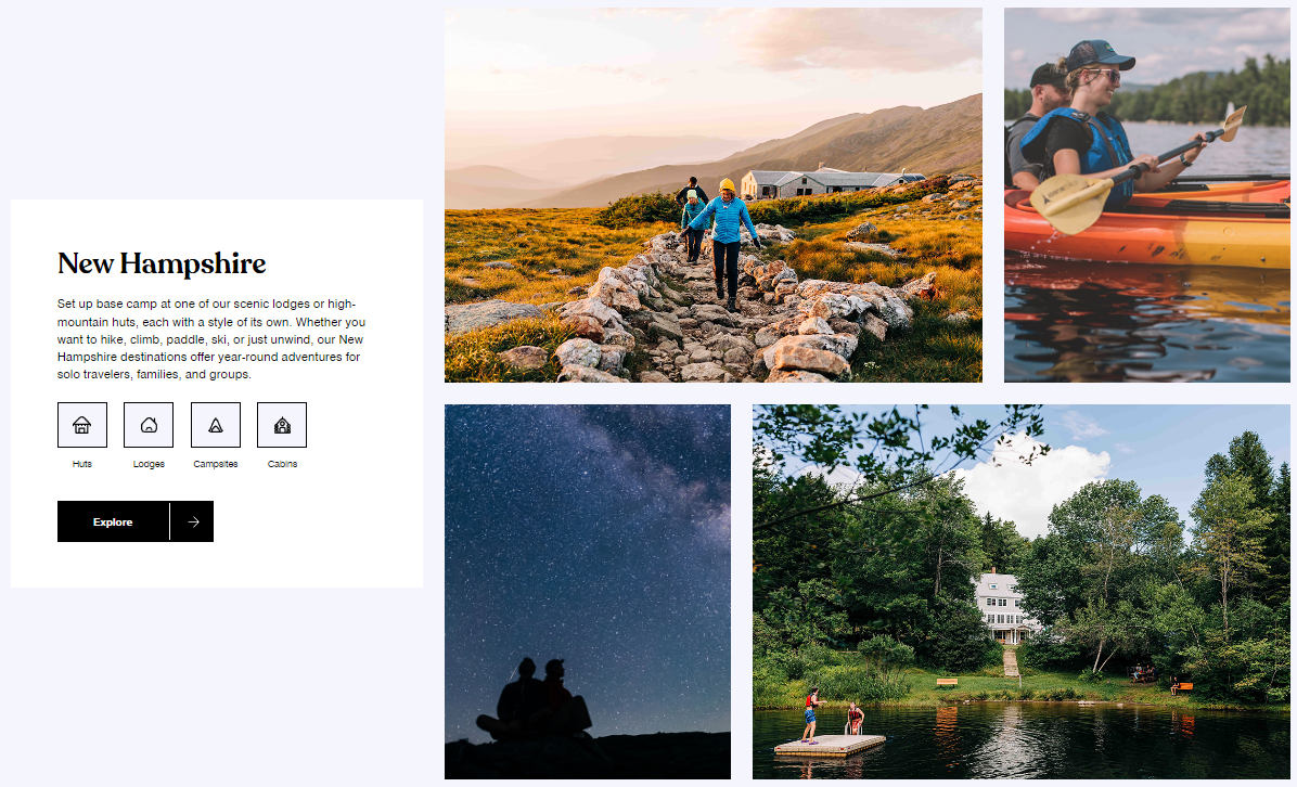
In the example below, Appalachian Mountain Club does a great job establishing an adventurous tone throughout their website by using a simple color palette, playful fonts and loads of beautiful images featuring different activities and locations.
On other sites, a large number of images could be problematic, but by using the same color treatments across all images, AMC avoids visual chaos and increases overall cohesion and interest.
Don’t: Forget About Your Visitors
In addition to consistency, relevancy is a key factor of effective design. It can be easy to get carried away and focus on your own style as you work on your website redesign. But your website isn’t for you – it’s for your visitors.
People want to feel connected to your business, and if they don’t resonate with your site’s content and design, they’ll likely leave in search of a more relevant option.
Do: Share Your Personality and Brand Style as Appropriate
Different industries and visitor types call for different levels and tones of personality. If your personal brand plays a large role in the services or products you offer, then definitely incorporate it into your website.
If your industry is more formal and traditional, then personal branding is less appropriate and instead you would want to show more of the overall company’s personality.
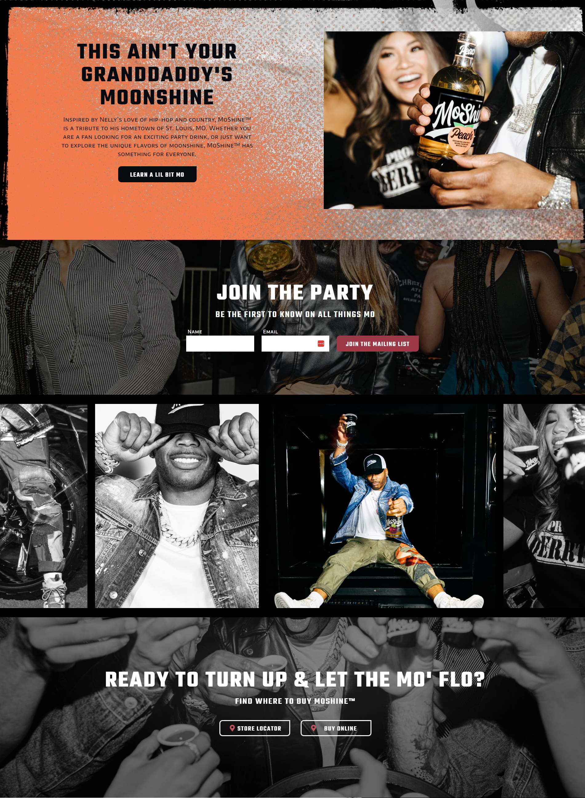
MoShine is a new line of moonshine created by icon Nelly and the brand’s style leans heavily on Nelly and his background. But, the site doesn’t forget about Moshine’s target audience and strategically incorporates language and elements to capture their attention and bring them into the lifestyle.
It isn’t fitting for all websites to incorporate such a strong personal brand, but that doesn’t mean that a site has to feel stiff or impersonal. Even if you don’t have a face behind the name, you can add elements to represent your brand’s personality and values.
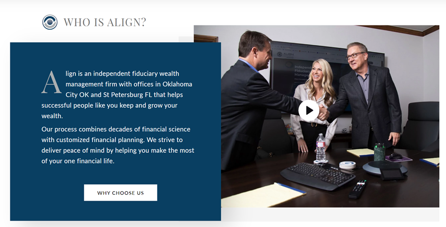
Align Wealth Management’s website was designed to emphasize the firm’s experience and sophistication. The site incorporates personal elements, including imagery and a video that features the Align team, while still maintaining their sense of professionalism.
Don’t: Fill your Website with Stock Photos
We’ve all been to a website that very obviously uses generic stock photos, and even worse, the same exact photos or models as many other sites. Too many stock photos can reduce the quality and professionalism of your site and doesn’t spark the personal connection you should strive to create.
Do: Feature Images that Resemble Your Ideal Customer
To avoid generic stock photo fatigue, use imagery that resembles your ideal client type. For instance, if you work exclusively with retirees, your site’s photography should feature people close to retirement age.
While custom photography is preferred, stock photos can work as long as they are high quality and in line with your company style and ideal customer persona.
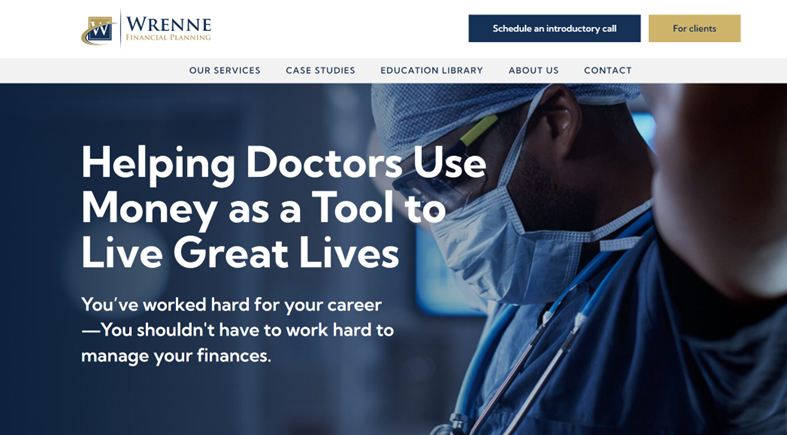
If people haven’t been to your website before, they’ll be looking for clues that you have the knowledge, experience, and products or services to help them. Wrenne Financial’s website design makes it clear from the start that they help doctors with their finances.
The medical references establish a connection with Wrenne’s ideal client types from the start and reaffirm to any doctors that they’re in the right place.
Don’t: Add animations to every element of your website
Movement captures people’s attention, but too much can be overstimulating. If you have too much motion on your site, people can get distracted and miss out on important content. Some may feel so overwhelmed that they choose to leave the site entirely.
Do: Incorporate Some Dynamic and Interactive Elements
More often than not, less is more with web design. Subtle motion is becoming more and more common on websites as technology evolves. Having some videos, small movement, and interactive elements can keep your visitors engaged.
We use “micro-animations” on almost every website we build. A micro-animation is a small movement triggered by a visitor’s actions. Examples include panels that scroll into view as someone scrolls down the page, or icons/buttons that get bolder or change color when someone’s cursor lands on it.
Newman Windows and Doors implements several types of micro-animations throughout the website to keep visitors intrigued and create some interaction.
The simplicity and subtlety of the scroll-initiated and hover-over movements ensure that people won’t get overstimulated or distracted.
Don’t: Neglect the Mobile View of Your Design
As people’s schedules get busier, mobile use increases, which means your website is almost guaranteed to be viewed on a phone or tablet. There’s nothing more frustrating than visiting a website on mobile that doesn’t adjust for device sizes, essentially rendering the website unusable.
Do: Consider How Your Website Looks on Different Devices
To curate a user-friendly website regardless of the device people use, consider your website at a variety of widths. The designs should utilize breakpoints to adjust your site’s layout as the screen size changes.


Smartfi was designed with a mobile-first approach, which means that our designers chose the images, illustrations, font size, and buttons with a mobile screen size in mind.
The site effectively resizes when people view it on their phones, which allows them to get the same high-quality experience they would on their desktop or laptop without missing any content.
Don’t: Forget About User Experience Best Practices
It’s easy to spot a website that has poor user experience. From low image quality to inconsistent design elements to difficult navigation, bad websites can make or break a company’s success.
While not every UX best practice applies to every business, user experience should always be taken into consideration as you design your website.
Do: Have Fun and Get Creative
There’s a lot of competition nowadays, and your website is a great place to stand out. While you always want to make sure that your website is easy to navigate and shares content in a clear way, you can still have some fun with your design.
The ultimate message is that your website design is all about balance. There is no specific rulebook for an effective design since everyone’s preferences are different. But, most high-quality websites are effective when they establish a cohesive design that considers the people viewing it.